URBAN OUTFITTERS INTERNSHIP
URBAN OUTFITTERS INTERNSHIP
URBAN OUTFITTERS INTERNSHIP
Help optimizing 900+ warehouse employees experience
Help optimizing 900+ warehouse employees experience
Help optimizing 900+ warehouse employees experience


Description ✍️
Description ✍️
Description ✍️
This project is centered around resolving the challenges that warehouse employees at Urban Outfitters faced. The result sucessfully reduced the task completion time by 50% and enhance user accessibility.
This project is centered around resolving the challenges that warehouse employees at Urban Outfitters faced. The result sucessfully reduced the task completion time by 50% and enhance user accessibility.
This project is centered around resolving the challenges that warehouse employees at Urban Outfitters faced. The result sucessfully reduced the task completion time by 50% and enhance user accessibility.
Role
Role
Role
UX Designer
UX Designer
UX Designer
UI Designer
UI Designer
UI Designer
Deliverables
Deliverables
Deliverables
High-fidelity Prototype
High-fidelity Prototype
High-fidelity Prototype
Iconography Libraries (Design System)
Iconography Libraries (Design System)
Iconography Libraries (Design System)
Impact
Impact
Impact
50% decrease in Task Completion Time
50% decrease in Task Completion Time
50% decrease in Task Completion Time
35% decrease expected in accdiental taps
35% decrease expected in accdiental taps
35% decrease expected in accdiental taps
NUULY
NUULY
NUULY
What You Need To Know ⭐

Improved working experience of 900+ warehouse workers
Improved working experience of 900+ warehouse workers
Improved working experience of 900+ warehouse workers
Even after my internship, the redesigned interface continues to positively impact over 900 warehouse workers.
Even after my internship, the redesigned interface continues to positively impact over 900 warehouse workers.
Even after my internship, the redesigned interface continues to positively impact over 900 warehouse workers.
Advocate to change the team's Road Map
Advocate to change the team's Road Map
Advocate to change the team's Road Map
This is the first time Nuuly Urban Outfitters opened an intern position for UX Design. I was lucky to be their first intern and documented my experience into a "Intern Guidebook" to help future UX Design interns onboard.
This is the first time Nuuly Urban Outfitters opened an intern position for UX Design. I was lucky to be their first intern and documented my experience into a "Intern Guidebook" to help future UX Design interns onboard.
This is the first time Nuuly Urban Outfitters opened an intern position for UX Design. I was lucky to be their first intern and documented my experience into a "Intern Guidebook" to help future UX Design interns onboard.

Initiate the transition of Nuuly Dark Mode
Initiate the transition of Nuuly Dark Mode
Initiate the transition of Nuuly Dark Mode
The redesigned iconography guidelines and design system sparked the team's interest in transitioning Nuuly to Dark Mode.
The redesigned iconography guidelines and design system sparked the team's interest in transitioning Nuuly to Dark Mode.
The redesigned iconography guidelines and design system sparked the team's interest in transitioning Nuuly to Dark Mode.
Final Product 🏆
Final Product 🏆
Final Product 🏆
Throughout 12 weeks, I helped redesigned the mobile interfaces and Iconography. The product then underwent development into products after my internship and successfully improved warehouse employees working experience.
Throughout 12 weeks, I helped redesigned the mobile interfaces and Iconography. The product then underwent development into products after my internship and successfully improved warehouse employees working experience.
Throughout 12 weeks, I helped redesigned the mobile interfaces and Iconography. The product then underwent development into products after my internship and successfully improved warehouse employees working experience.
Single-Handed Friendly
Single-Handed Friendly
Single-Handed Friendly
The redesigned interface allows warehouse workers to use it with one hand, freeing their other hand to hold racks of clothes. This design significantly enhances ease of use and efficiency.
The redesigned interface allows warehouse workers to use it with one hand, freeing their other hand to hold racks of clothes. This design significantly enhances ease of use and efficiency.
The redesigned interface allows warehouse workers to use it with one hand, freeing their other hand to hold racks of clothes. This design significantly enhances ease of use and efficiency.

New Iconography 📙
New Iconography 📙
New Iconography 📙
The redesigned iconography inspired Nuuly UX Team to explored the customer-facing website transitioning to Dark Mode. For the next 12 weeks of the internship, I continuted to explored "The Dark Mode Guidebook" for Nuuly.
The redesigned iconography inspired Nuuly UX Team to explored the customer-facing website transitioning to Dark Mode. For the next 12 weeks of the internship, I continuted to explored "The Dark Mode Guidebook" for Nuuly.
The redesigned iconography inspired Nuuly UX Team to explored the customer-facing website transitioning to Dark Mode. For the next 12 weeks of the internship, I continuted to explored "The Dark Mode Guidebook" for Nuuly.

The Problem 🚩
The Problem 🚩
The Problem 🚩
Warehouse employees experienced frequent accidental taps and struggled to navigate through complex menus because they were holding the cloth with one hand and interacting with the mobile device with the other, leading to slower task completion times.
Warehouse employees experienced frequent accidental taps and struggled to navigate through complex menus because they were holding the cloth with one hand and interacting with the mobile device with the other, leading to slower task completion times.
Warehouse employees experienced frequent accidental taps and struggled to navigate through complex menus because they were holding the cloth with one hand and interacting with the mobile device with the other, leading to slower task completion times.
✋
Poor Interaction Design
Poor Interaction Design
Poor Interaction Design
Warehouse employees were holding racks of clothes while and interacting with mobile devices on one hand
Warehouse employees were holding racks of clothes while and interacting with mobile devices on one hand
Warehouse employees were holding racks of clothes while and interacting with mobile devices on one hand
⏰
Delays
Delays
Delays
The confusion with poor hand interaction leads to delays in perfoming tasks
The confusion with poor hand interaction leads to delays in perfoming tasks
The confusion with poor hand interaction leads to delays in perfoming tasks
😕
😕
Confusion
Confusion
The confusion caused by the iconography libraries
The confusion caused by the iconography libraries
The confusion caused by the iconography libraries
"We only use the device with one hand
and busy holding clothes on the other hand."
"We only use the device with one hand and busy holding clothes on the other hand."
"We only use the device with one hand
and busy holding clothes on the other hand."
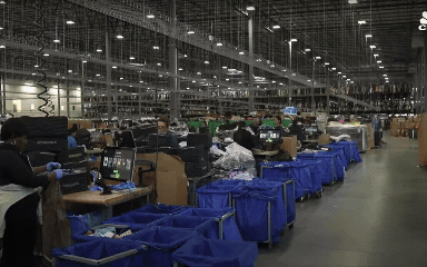
A Warehouse Visit 📝
A Warehouse Visit 📝
A Warehouse Visit 📝
Field Studies
Field Studies
Field Studies
To gain deeper insights, my manager and UX Team conducted an on-site visit to observe how employees interacted with our app in a real-world environment.
To gain deeper insights, my manager and UX Team conducted an on-site visit to observe how employees interacted with our app in a real-world environment.
To gain deeper insights, my manager and UX Team conducted an on-site visit to observe how employees interacted with our app in a real-world environment.
Talking To Warehouse Workers
Talking To Warehouse Workers
Talking To Warehouse Workers
During the visit, I closely observed employees as they navigated the app while performing their daily tasks. It became evident that many employees were, indeed, using the app with one hand while holding items in the other. Observing employees use the app with one hand while holding items confirmed the need for our project to minimize interactions and enhance usability for Single-Handed Mode ✋
During the visit, I closely observed employees as they navigated the app while performing their daily tasks. It became evident that many employees were, indeed, using the app with one hand while holding items in the other. Observing employees use the app with one hand while holding items confirmed the need for our project to minimize interactions and enhance usability for Single-Handed Mode ✋
During the visit, I closely observed employees as they navigated the app while performing their daily tasks. It became evident that many employees were, indeed, using the app with one hand while holding items in the other. Observing employees use the app with one hand while holding items confirmed the need for our project to minimize interactions and enhance usability for Single-Handed Mode ✋


The Unexpected Problem 😱
The Unexpected Problem 😱
The Unexpected Problem 😱
During the visit, by talking to the warehouse employees, we discovered that issues extended beyond the home screen to the confusing iconography. Many icons did not have clear meanings. In a warehouse setting, there are much more complicated tasks like "Inbound", "Outbound", "Inventory count", and many others, which the current iconography does not adequately represent. This confusion worsened delays and hindered efficiency.
During the visit, by talking to the warehouse employees, we discovered that issues extended beyond the home screen to the confusing iconography. Many icons did not have clear meanings. In a warehouse setting, there are much more complicated tasks like "Inbound", "Outbound", "Inventory count", and many others, which the current iconography does not adequately represent. This confusion worsened delays and hindered efficiency.
During the visit, by talking to the warehouse employees, we discovered that issues extended beyond the home screen to the confusing iconography. Many icons did not have clear meanings. In a warehouse setting, there are much more complicated tasks like "Inbound", "Outbound", "Inventory count", and many others, which the current iconography does not adequately represent. This confusion worsened delays and hindered efficiency.

Design System 🎨
Design System 🎨
Design System 🎨
Iconography Evaluation
Iconography Evaluation
Iconography Evaluation
The in-depth evaluation of the current iconography was conducted. The pain points being identified include varying visual weights disrupt the hierarchy and ambiguity in representation causes confusion, resulting in errors and delays
The in-depth evaluation of the current iconography was conducted. The pain points being identified include varying visual weights disrupt the hierarchy and ambiguity in representation causes confusion, resulting in errors and delays
The in-depth evaluation of the current iconography was conducted. The pain points being identified include varying visual weights disrupt the hierarchy and ambiguity in representation causes confusion, resulting in errors and delays

Sketching
Sketching
Sketching
Sketching various ideas helped shape the design decisions. I analyzed each icon for its visual style and meaning, following my mentor's recommendations.
Sketching various ideas helped shape the design decisions. I analyzed each icon for its visual style and meaning, following my mentor's recommendations.
Sketching various ideas helped shape the design decisions. I analyzed each icon for its visual style and meaning, following my mentor's recommendations.
I realized the importance of having a standardized design system to make the icons look consistent. My mentor recommended examining some well-known design system libraries like Fluent Design System by Microsoft and Carbon Design System by IBM. Inspired by these, I developed comprehensive iconography guidelines.
I realized the importance of having a standardized design system to make the icons look consistent. My mentor recommended examining some well-known design system libraries like Fluent Design System by Microsoft and Carbon Design System by IBM. Inspired by these, I developed comprehensive iconography guidelines.
I realized the importance of having a standardized design system to make the icons look consistent. My mentor recommended examining some well-known design system libraries like Fluent Design System by Microsoft and Carbon Design System by IBM. Inspired by these, I developed comprehensive iconography guidelines.

Iconography Guidelines 📐
Iconography Guidelines 📐
Iconography Guidelines 📐
The guidelines break down the construction of an icon, including aspects such as visual weight, line weight, and line break corners. They ensure that all icons maintain a uniform appearance and are easily recognizable. These guidelines covered:
The guidelines break down the construction of an icon, including aspects such as visual weight, line weight, and line break corners. They ensure that all icons maintain a uniform appearance and are easily recognizable. These guidelines covered:
The guidelines break down the construction of an icon, including aspects such as visual weight, line weight, and line break corners. They ensure that all icons maintain a uniform appearance and are easily recognizable. These guidelines covered:
Visual Weight: Ensuring each icon maintains a balanced visual weight, making them easily identifiable at a glance.
Visual Weight: Ensuring each icon maintains a balanced visual weight, making them easily identifiable at a glance.
Visual Weight: Ensuring each icon maintains a balanced visual weight, making them easily identifiable at a glance.
Line Weight: Standardizing the line thickness across all icons to create a cohesive look.
Line Weight: Standardizing the line thickness across all icons to create a cohesive look.
Line Weight: Standardizing the line thickness across all icons to create a cohesive look.
Corners and Line Breaks: Defining the radius for rounded corners and the style for line breaks to ensure consistency.
Corners and Line Breaks: Defining the radius for rounded corners and the style for line breaks to ensure consistency.
Corners and Line Breaks: Defining the radius for rounded corners and the style for line breaks to ensure consistency.
Symbol Clarity: Making sure each icon clearly represents its function, especially for complex warehouse tasks like inbound, outbound, and inventory count.
Symbol Clarity: Making sure each icon clearly represents its function, especially for complex warehouse tasks like inbound, outbound, and inventory count.
Symbol Clarity: Making sure each icon clearly represents its function, especially for complex warehouse tasks like inbound, outbound, and inventory count.
➡️ Creating these guidelines not only improved the current project but also provided a framework for future design consistency within the company.
➡️ Creating these guidelines not only improved the current project but also provided a framework for future design consistency within the company.
➡️ Creating these guidelines not only improved the current project but also provided a framework for future design consistency within the company.

What Icons Make Sense To You?
What Icons Make Sense To You?
What Icons Make Sense To You?
I conducted user interviews from employees in the warehouse to gather feedback, guaranteeing that the icons were not only visually appealing but also intuitive and user-friendly. Conducted interviews with warehouse employees to ensure the icons were visually appealing and user-friendly. The process involved multiple iterations and feedback loops. I collaborated closely with the UX Design & Developer team to make necessary adjustments and improvements, ensuring that the icons met the project's objectives.
I conducted user interviews from employees in the warehouse to gather feedback, guaranteeing that the icons were not only visually appealing but also intuitive and user-friendly. Conducted interviews with warehouse employees to ensure the icons were visually appealing and user-friendly. The process involved multiple iterations and feedback loops. I collaborated closely with the UX Design & Developer team to make necessary adjustments and improvements, ensuring that the icons met the project's objectives.
I conducted user interviews from employees in the warehouse to gather feedback, guaranteeing that the icons were not only visually appealing but also intuitive and user-friendly. Conducted interviews with warehouse employees to ensure the icons were visually appealing and user-friendly. The process involved multiple iterations and feedback loops. I collaborated closely with the UX Design & Developer team to make necessary adjustments and improvements, ensuring that the icons met the project's objectives.

Final Iconography 🏆
Final Iconography 🏆
Final Iconography 🏆
After four weeks of work and mentorship and through several iterations, the redesigned icon system was finalized. The new icons received a lot of positive feedback. Some icons were redesigned with the branded "Nu" logo, indicating Nuuly's branding identity.The transformation included:
After four weeks of work and mentorship and through several iterations, the redesigned icon system was finalized. The new icons received a lot of positive feedback. Some icons were redesigned with the branded "Nu" logo, indicating Nuuly's branding identity.The transformation included:
After four weeks of work and mentorship and through several iterations, the redesigned icon system was finalized. The new icons received a lot of positive feedback. Some icons were redesigned with the branded "Nu" logo, indicating Nuuly's branding identity.The transformation included:
Incorporating Nuuly Branding: The redesigned icons featured the "Nu" logo, which reinforced brand identity and familiarity among users.
Incorporating Nuuly Branding: The redesigned icons featured the "Nu" logo, which reinforced brand identity and familiarity among users.
Incorporating Nuuly Branding: The redesigned icons featured the "Nu" logo, which reinforced brand identity and familiarity among users.
Enhanced Clarity and Functionality: Each icon was meticulously crafted to ensure it accurately represented its function.
Enhanced Clarity and Functionality: Each icon was meticulously crafted to ensure it accurately represented its function.
Enhanced Clarity and Functionality: Each icon was meticulously crafted to ensure it accurately represented its function.
User-Centric Design: Feedback from warehouse employees was integral to the redesign process, ensuring the icons were intuitive and user-friendly.
User-Centric Design: Feedback from warehouse employees was integral to the redesign process, ensuring the icons were intuitive and user-friendly.
User-Centric Design: Feedback from warehouse employees was integral to the redesign process, ensuring the icons were intuitive and user-friendly.
Outcomes 📝
Outcomes 📝
Outcomes 📝
The redesigned iconography was successfully implemented and is currently in active use. The positive feedback highlighted the effectiveness of the redesign in enhancing usability and user satisfaction.
The redesigned iconography was successfully implemented and is currently in active use. The positive feedback highlighted the effectiveness of the redesign in enhancing usability and user satisfaction.
The redesigned iconography was successfully implemented and is currently in active use. The positive feedback highlighted the effectiveness of the redesign in enhancing usability and user satisfaction.

Prototype ✏️
Prototype ✏️
Prototype ✏️
UX Audit & Ideation
UX Audit & Ideation
UX Audit & Ideation
Similar to the iconography redesign, I began a UX audit to evaluate all the pros and cons of the current interface to understand why it was difficult for users to interact with one hand. After a thorough evaluation, I identified several key issues and suggested solutions:
Similar to the iconography redesign, I began a UX audit to evaluate all the pros and cons of the current interface to understand why it was difficult for users to interact with one hand. After a thorough evaluation, I identified several key issues and suggested solutions:
Similar to the iconography redesign, I began a UX audit to evaluate all the pros and cons of the current interface to understand why it was difficult for users to interact with one hand. After a thorough evaluation, I identified several key issues and suggested solutions:
❌ Menu Complexity: The current interface had multiple layers of menus, making it difficult for users to quickly access frequently used features.
❌ Menu Complexity: The current interface had multiple layers of menus, making it difficult for users to quickly access frequently used features.
❌ Menu Complexity: The current interface had multiple layers of menus, making it difficult for users to quickly access frequently used features.
➡️ Simplifying Menu Structure: I proposed a more streamlined menu with fewer layers, allowing users to access key features with fewer taps.
➡️ Simplifying Menu Structure: I proposed a more streamlined menu with fewer layers, allowing users to access key features with fewer taps.
➡️ Simplifying Menu Structure: I proposed a more streamlined menu with fewer layers, allowing users to access key features with fewer taps.
❌ Small Touch Targets: Buttons and interactive elements were too small, leading to frequent accidental taps.
❌ Small Touch Targets: Buttons and interactive elements were too small, leading to frequent accidental taps.
❌ Small Touch Targets: Buttons and interactive elements were too small, leading to frequent accidental taps.
➡️ Enlargering Touch Targets: I redesigned buttons and interactive elements to be larger and more spaced out, reducing accidental taps.
➡️ Enlargering Touch Targets: I redesigned buttons and interactive elements to be larger and more spaced out, reducing accidental taps.
➡️ Enlargering Touch Targets: I redesigned buttons and interactive elements to be larger and more spaced out, reducing accidental taps.
❌ Poor Gesture Support: The interface lacked support for gestures, which are essential for one-handed use.
❌ Poor Gesture Support: The interface lacked support for gestures, which are essential for one-handed use.
❌ Poor Gesture Support: The interface lacked support for gestures, which are essential for one-handed use.
➡️ Enhancing Gesture Integration: I incorporated swipe and tap gestures to make navigation more intuitive and suited for one-handed use.
➡️ Enhancing Gesture Integration: I incorporated swipe and tap gestures to make navigation more intuitive and suited for one-handed use.
➡️ Enhancing Gesture Integration: I incorporated swipe and tap gestures to make navigation more intuitive and suited for one-handed use.
Sketching and Wireframes
Sketching and Wireframes
I created sketches and wireframes to outline the new layout and structure of the interface. These low-fidelity designs allowed me to quickly identify and address potential usability issues.
I created sketches and wireframes to outline the new layout and structure of the interface. These low-fidelity designs allowed me to quickly identify and address potential usability issues.

High-Fidelity
High-Fidelity
Following the wireframes, I developed a high-fidelity prototype incorporating the new design elements and user flows. This prototype was tested extensively to ensure it met the project's objectives.
Following the wireframes, I developed a high-fidelity prototype incorporating the new design elements and user flows. This prototype was tested extensively to ensure it met the project's objectives.

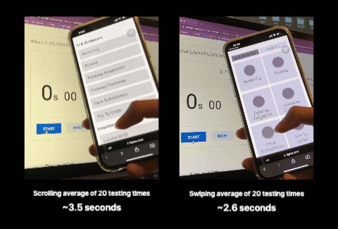
Testing My Hypothesis
Testing My Hypothesis
To test which layout would achieve faster access with one-handed interaction, I evaluated two different interactions: swiping versus scrolling. To test my hepothesis, I conducted an interaction testing to compare two menu prototype options and masure their performance. The protype was tested 20 times based on three hands' length sizes: 6" (Small), 7.35" (Medium) and 9.8" (Large)
To test which layout would achieve faster access with one-handed interaction, I evaluated two different interactions: swiping versus scrolling. To test my hepothesis, I conducted an interaction testing to compare two menu prototype options and masure their performance. The protype was tested 20 times based on three hands' length sizes: 6" (Small), 7.35" (Medium) and 9.8" (Large)
The below videos were recorded from the Small hand testing.However, the overall results show that one option emerged as notably faster. The Swiping options show to be from 0.8~1 second faster than the Scrolling option. This testing provides general understanding on our direction to redesign the interface.
The below videos were recorded from the Small hand testing.However, the overall results show that one option emerged as notably faster. The Swiping options show to be from 0.8~1 second faster than the Scrolling option. This testing provides general understanding on our direction to redesign the interface.
➡️ Swiping allowed users to navigate more efficiently, reducing the time required to access different features and minimizing accidental taps.
➡️ Swiping allowed users to navigate more efficiently, reducing the time required to access different features and minimizing accidental taps.
Design Iterations
Design Iterations
Through multiple design iterations and user testing, we refined the prototype to improve usability. We simplified the menu display and allowed users to navigate via swiping and tapping. After revising several design iterations, our team decided to simply the menu display, as well as allowing users to have both interactions to navigate between screens: Swiping and Tapping
Through multiple design iterations and user testing, we refined the prototype to improve usability. We simplified the menu display and allowed users to navigate via swiping and tapping. After revising several design iterations, our team decided to simply the menu display, as well as allowing users to have both interactions to navigate between screens: Swiping and Tapping

Who Am I Designing For? 🤔
Who Am I Designing For? 🤔
I'm designing for...
I'm designing for...
I'm designing for...
Workers age range from 40-60 years old
Workers age range from 40-60 years old
Workers age range from 40-60 years old

I'm designing for...
I'm designing for...
I'm designing for...
They work under bright light conditions with expose to eye fatigue
They work under bright light conditions with expose to eye fatigue
They work under bright light conditions with expose to eye fatigue

I'm designing for...
I'm designing for...
I'm designing for...
They often wear glasses and struggles with readability
They often wear glasses and struggles with readability
They often wear glasses and struggles with readability

I'm designing for...
I'm designing for...
I'm designing for...
...And who English is not their primary or first language
...And who English is not their primary or first language
...And who English is not their primary or first language

Final Product 🏆
Final Product 🏆
Final Product 🏆
The final product, delivered as high-fidelity desktop, mobile, and tablet experiences, underwent development into products after my internship. Now, the new interface design continues to be utilized internally.
The final product, delivered as high-fidelity desktop, mobile, and tablet experiences, underwent development into products after my internship. Now, the new interface design continues to be utilized internally.
The final product, delivered as high-fidelity desktop, mobile, and tablet experiences, underwent development into products after my internship. Now, the new interface design continues to be utilized internally.
✅ Single-handed friendly
✅ Single-handed friendly
✅ Single-handed friendly
✅ Intuitive visual design
✅ Intuitive visual design
✅ Intuitive visual design
✅ Simpler workflow
✅ Simpler workflow
✅ Simpler workflow
Single-Handed Friendly
Single-Handed Friendly
Single-Handed Friendly
The redesigned interface allows warehouse workers to use it with one hand, freeing their other hand to hold racks of clothes. This design significantly enhances ease of use and efficiency.
The redesigned interface allows warehouse workers to use it with one hand, freeing their other hand to hold racks of clothes. This design significantly enhances ease of use and efficiency.
The redesigned interface allows warehouse workers to use it with one hand, freeing their other hand to hold racks of clothes. This design significantly enhances ease of use and efficiency.
Intuitive Icons
Intuitive Icons
Intuitive Icons
Recognizing that not all warehouse workers are familiar with iconography, we implemented easily understandable and intuitive icons. This ensures that all workers, regardless of their background, can navigate the app effortlessly.
Recognizing that not all warehouse workers are familiar with iconography, we implemented easily understandable and intuitive icons. This ensures that all workers, regardless of their background, can navigate the app effortlessly.
Recognizing that not all warehouse workers are familiar with iconography, we implemented easily understandable and intuitive icons. This ensures that all workers, regardless of their background, can navigate the app effortlessly.

Learning Takeaways 📚
Learning Takeaways 📚
Learning Takeaways 📚
Working as a UX Design co-op at Urban Outfitters was my most professional experience outside of the classroom. This opportunity allowed me to apply classroom knowledge to real-world scenarios, gaining invaluable insights into professional UX design practices.
Working as a UX Design co-op at Urban Outfitters was my most professional experience outside of the classroom. This opportunity allowed me to apply classroom knowledge to real-world scenarios, gaining invaluable insights into professional UX design practices.
Working as a UX Design co-op at Urban Outfitters was my most professional experience outside of the classroom. This opportunity allowed me to apply classroom knowledge to real-world scenarios, gaining invaluable insights into professional UX design practices.
I learned that success in the real world extends beyond designing alone. t involves confidently presenting and justifying design decisions to stakeholders, demonstrating the importance of effective communication to design solutions for the users.
I learned that success in the real world extends beyond designing alone. t involves confidently presenting and justifying design decisions to stakeholders, demonstrating the importance of effective communication to design solutions for the users.
I learned that success in the real world extends beyond designing alone. t involves confidently presenting and justifying design decisions to stakeholders, demonstrating the importance of effective communication to design solutions for the users.
Inclusive Design 👴🏻
Inclusive Design 👴🏻
Inclusive Design 👴🏻
The project helps reinforcing the principle that great design caters to all, ensuring usability for diverse user groups.
Warehouses Are Big 📦
Warehouses Are Big 📦
Warehouses Are Big 📦
I visited multiple warehouse and got a chance to observe the "behind the scene" work at Urban Outfitters.
Convince Your Decision 💬
Convince Your Decision 💬
Convince Your Decision 💬
The real world is not just about designing, but also confidently presenting and justifying your decisions to stakeholders.
Just Ask The Question 🙋
Just Ask The Question 🙋
Just Ask The Question 🙋
It's okay if you don't understand something. Always actively asking to seek clarity if you have any questions.
Other Projects
Other Projects
Other Projects


Vanguard: AI Feedback Summary Tool
Vanguard: AI Feedback Summary Tool
Vanguard: AI Feedback Summary Tool
Saving $400K+ USD for Vanguard with Generative AI
Saving $400K+ USD for Vanguard with Generative AI
Saving $400K+ USD for Vanguard with Generative AI
View More


The Walt Disney: Designing Magical Experiences
The Walt Disney: Designing Magical Experiences
The Walt Disney: Designing Magical Experiences
Disney's Expansion into Southeast Asia
Disney's Expansion into Southeast Asia
Disney's Expansion into Southeast Asia
View More


SafePlate
SafePlate
SafePlate
Help groups with diverse dietary restrictions to find restaurants
Help groups with diverse dietary restrictions to find restaurants
Help groups with diverse dietary restrictions to find restaurants
View More

Rapid Prototyping: Gen AI Hackathons
Rapid Prototyping: Gen AI Hackathons
Rapid Prototyping: Gen AI Hackathons
Three hackathon projects using Gen AI to solve real-world problems
Three hackathon projects using Gen AI to solve real-world problems
Three hackathon projects using Gen AI to solve real-world problems
View More

